
开始学习数据可视化,在此记录,目前主要是先学Python中的matplotlib这个包,这个包和MATLAB中的作图很相似,具有很高的自定义性,等到这个学习的比较深入后再考虑了解拓展其他工具的作图。附上学习链接:https://matplotlib.org/gallery/index.html
直接到官网学习是最方便的,文档详细,demo生动。
补充
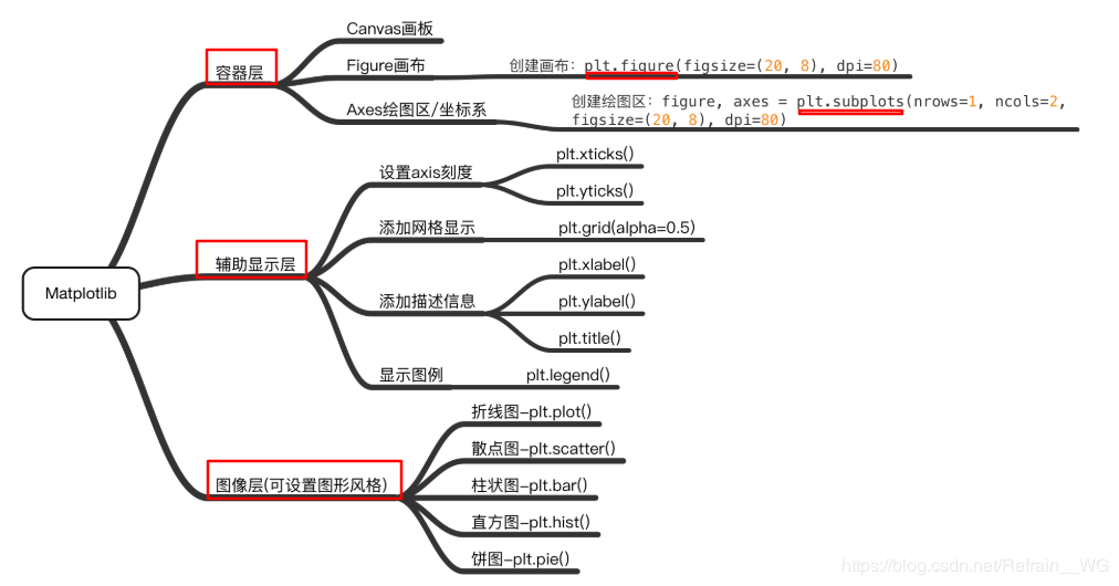
这是新发现的一张思维导图,非常清晰的展示了matplotlib的结构,非常helpful。
目录
第一部分:基础画图
1. 通用画图步骤
1 | ① 引包:import matplotlib.pyplot as plt; |
示例图片如下:
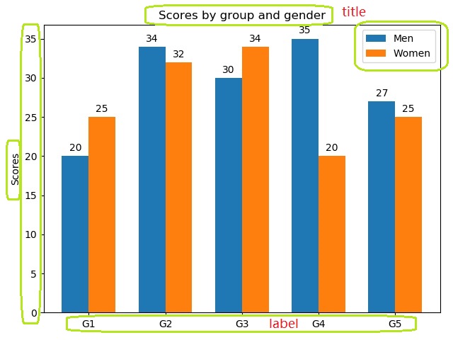
图中的绿色圈为后来添加上的,圈出的地方表示可以自定义
2. 散点图与折线图
代码如下:
1 | # 导入工具包 |
输出图片: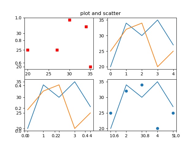
感悟:在这里是直接使用matplotlib自动画的折线图和散点图,做好的关键在与数据的准备,如果准备的数据好的话,可以直接调用.plot()输入一个变量画折线图,默认横轴为数组的序数;如果采用scatter画图的话,需要传入两个参数,第一个是x,一般是横轴,第二个是y,一般是因变量的值,需要注意这一点,参数数量要对。另外还有其他能够自定义图片的地方,后续会进一步介绍。
3. 柱状图
代码如下:
1 | import matplotlib |
图片输出: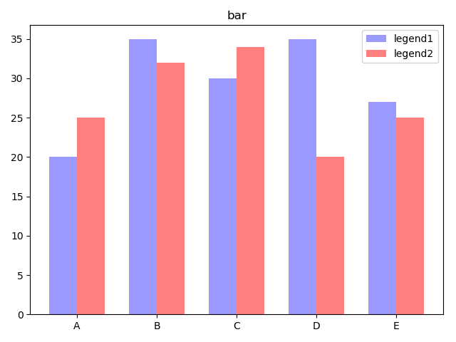
感悟:在这里最好指定bar的宽度,否则默认的宽度画图非常奇怪,另外,如果要同时画多个柱形图在一个刻度上,需要指定好偏移度,避免bar相互重合,具体的参数可以看上面的设置。
4. 饼图
代码如下:
1 | import matplotlib |
图片输出: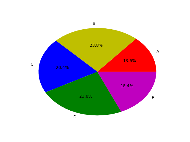
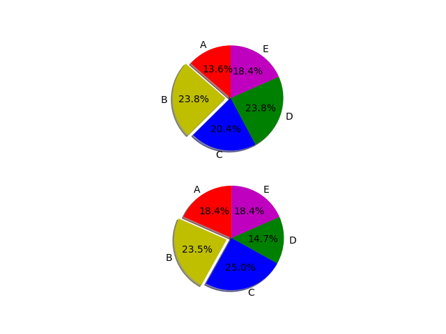
感悟:这个饼状图是真的丑,颜色的透明度没有办法设置,而且默认不是圆形的,看起来实在难看,可以考虑有没有替代的方案。>有.axis(‘equal’)这个参数可以设置为圆形。
补充
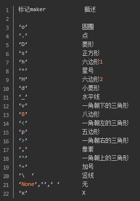
- 线条标记种类:
- 图片中颜色
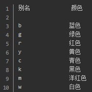
如果这些颜色不够用的话,还可以这么做:
(1)通过十六进制字符串 color=’#123456’指定或者使用合法的HTML颜色名字(’red’,’chartreuse’等)。
(2)传入一个归一化到[0,1]的RGB元组,如color=(0.3,0.3,0.4)
第二部分:画图进阶
1. 数学函数图像
命令如下:
1 | import matplotlib |
输出图片:
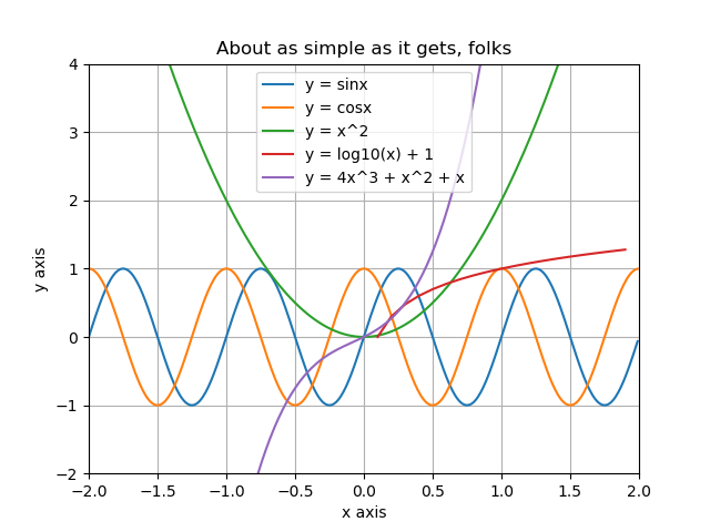
Be careful about that, in python, if you want to draw a image with mathmatics functions, you should import the pakage named numpy.
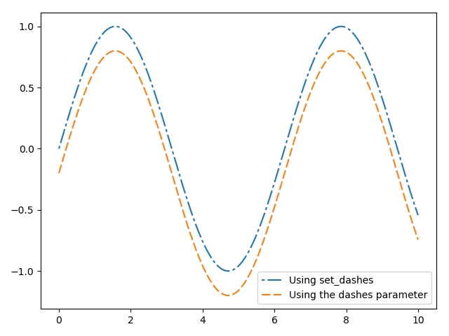
2. 虚线
代码如下:
1 | import matplotlib |
图片输出:
3. 引入ggplot style
code:
1 | import numpy as np |
图片输出
图片一下子的就精美多了,当然主要是替换了图片的通用设置,图片中元素的颜色还是需要自己搭配的。